Let’s create
success together.
Here the world is black and white.
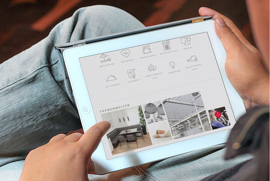
“Buildings should create space for a good life and work, putting people at the center!” – TWO IN A BOX is an architecture firm in Ottensheim that approached syreta with a clear brief: relaunch the existing website, maintain the “look and feel”, responsive design, an easy content management system.
The result: the design is simple, straight, understated – and thus provides a framework for the architecture of TWO IN A BOX. New is a project map that shows the “sphere of activity” of TWO IN A BOX.
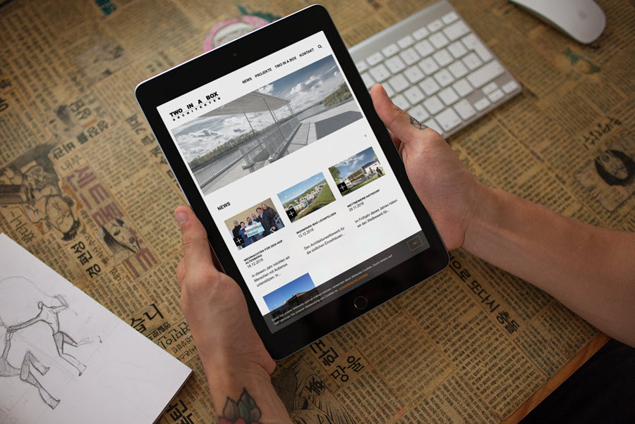
Black or white? Two architects – two viewpoints. Since no general consensus could be reached regarding the website’s background color, syreta simply programmed both color versions. So what now? Very simple: click the image with the number 2 in the footer (bottom right) and you will see: at TWO IN A BOX, the world is black AND white!
What makes the TWO IN A BOX website so likable is the solution to an actually unsolvable problem: two architects, two opinions about the background color. Instead of forcing a compromise, syreta simply implemented both versions – white and black, switchable with a click in the footer. That’s not a gimmick, but an elegant way of dealing with a real customer request.
The project map, which visualizes the firm’s sphere of activity geographically, is the second strong element: projects are not entries in a list, but points on a map – close, concrete, easy to grasp. Good architecture is functional. This website is too.
Websites for architecture firms – when the medium is the message
An architecture firm with a bad website sends a clear signal: anyone who doesn’t focus on quality for their own digital business card might not do so for their projects either. For TWO IN A BOX, the website relaunch was therefore not a box-ticking exercise, but a mark of quality. The clear brief — simple, straight, understated — also reflects the firm’s architectural philosophy: no ornamentation, no superfluous elements, the focus is on what matters. The newly added project map makes the regional sphere of activity of TWO IN A BOX visible at a glance — a simple but effective feature for a firm that wants to showcase its work locally. And the small technical sleight of hand with the two color versions — black or white, depending on a click in the footer — shows that syreta thinks beyond the obvious even on seemingly simple projects. It’s details like these that distinguish a website from a good website.
 Website Relaunch: TWO IN A BOX Architects